Brief / A grocery shopping app with minimalist design for better user experience
Tools / Adobe XD, Adobe Illustrator, Adobe After Effects
Tools / Adobe XD, Adobe Illustrator, Adobe After Effects
This is one of my UI mobile projects that I create with a fresh concept in mind. The grocery shopping is designed for simplicity.
Mock-ups are developed in Adobe XD and Prototype is developed in After Effects.
Mock-ups are developed in Adobe XD and Prototype is developed in After Effects.
Shopping Section
Items will be displayed with simple graphics for better user experience. To breakthrough the boring style of black & white texts, each block is covered with pastel color which can draw more attention towards the items.

Viewing Products
While viewing the products, users can also view the estimated delivery time for each product that they want to buy. Meanwhile, when users add an item on the cart, a new section will appear and displayed the numbers of items on current cart. This is a great feature to remind users of their shopping goals.

Checking Out
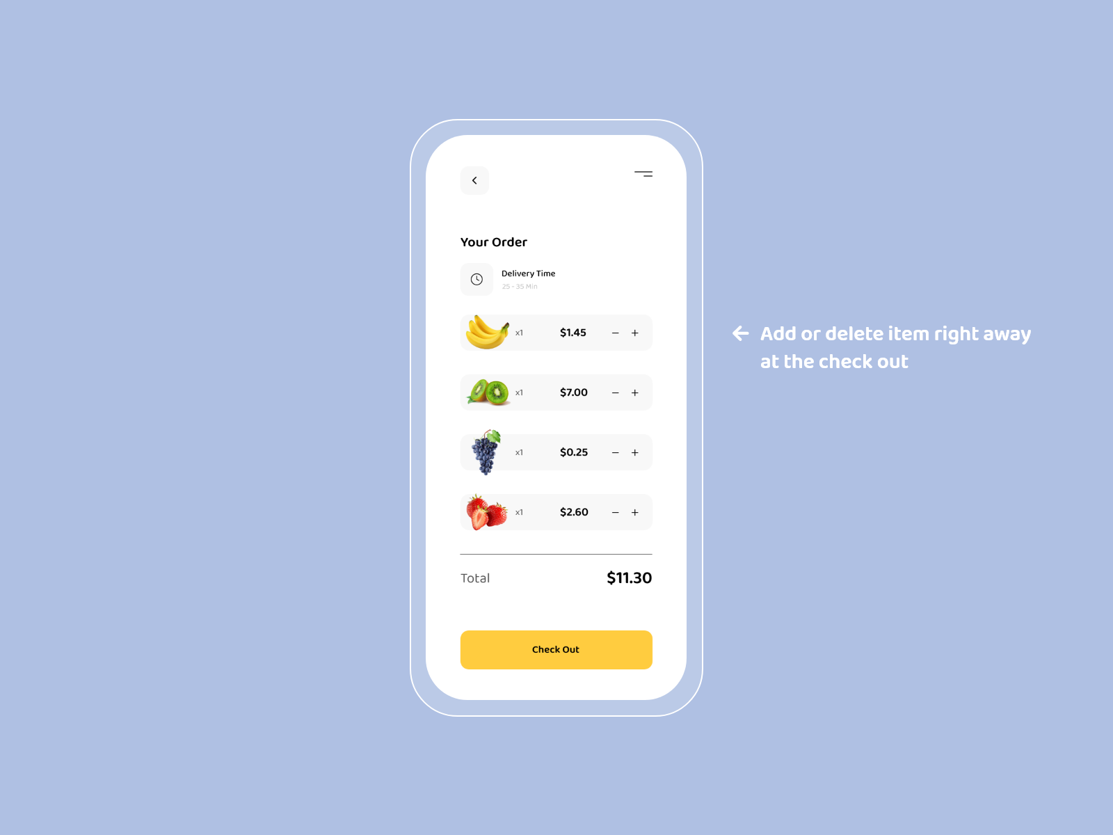
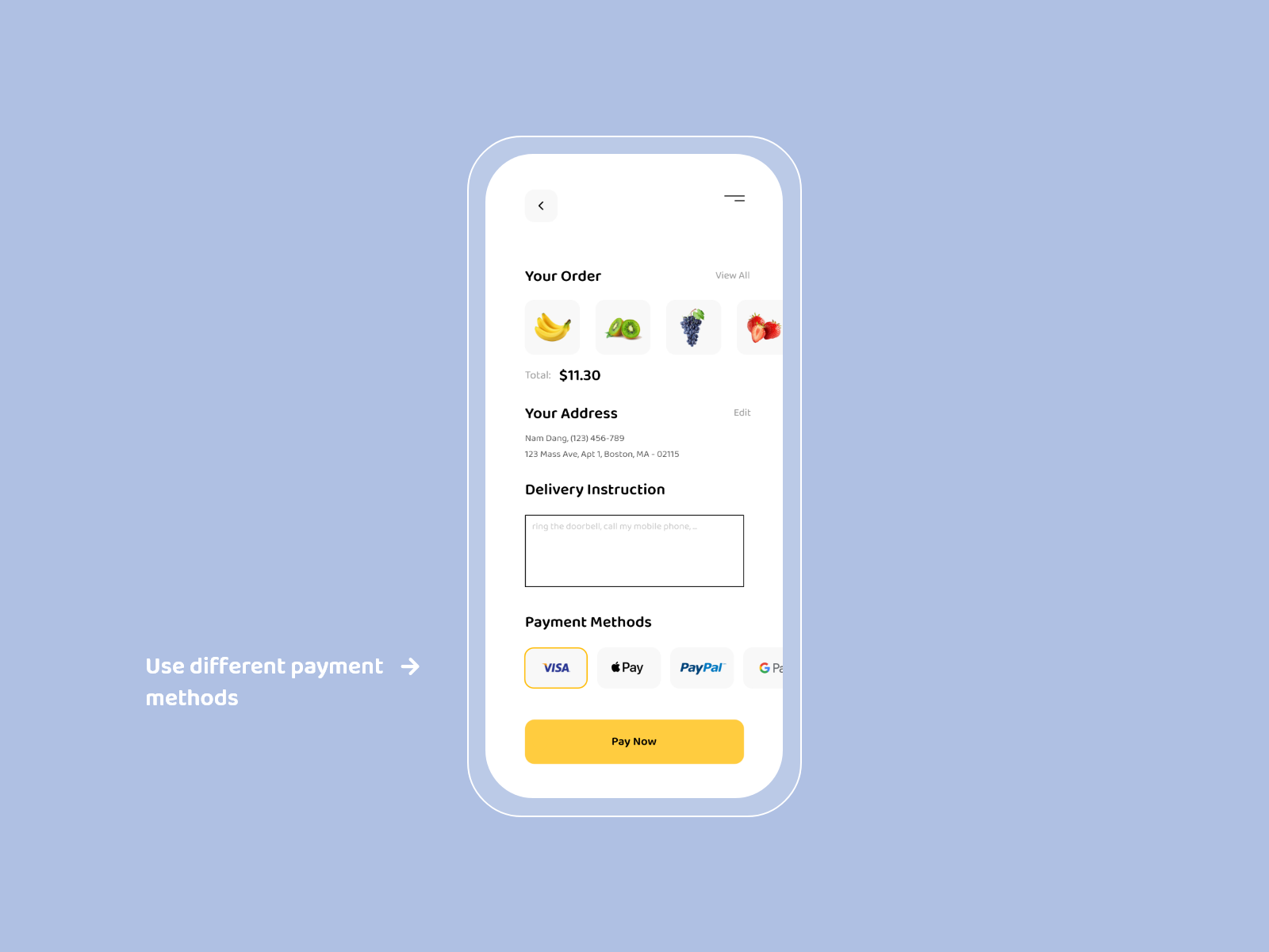
While checking out, users can add or delete items right away and the total money will also change. This is a nice feature to help users not going back and forth between different screens.

