
Brief / Design and implementing a new UI layout for Spotify's Playlist feature for better user experience
Tools / Adobe Illustrator & Adobe XD
Tools / Adobe Illustrator & Adobe XD
This was a self-made project that I did for myself. The problem I was trying to solve was helping users navigate and check out songs faster by designing a different layout for mostly swipe gestures. This problem actually bugged me sometimes because the Spotify app was mainly made to operate with 2 hands. Therefore, I hope this version could help people like myself have a better user experience.
The Problem
Problem 1: We only know about the title and the creator of the playlist in the main homepage.
Problem 2: To check what kinds of songs are on the playlist, we actually have to go to another screen and then back to the homepage again if we want to check another playlist.
Problem 3: The back button is at the top left of the screen. If people have a big phone or their hands are too small, it can be really hard to reach and make users more frustrated.


Wire-frame & Prototyping

The Drop-down
When users swipe right to each play list, the app will automatically drop-down a mini-list to help users checking out the songs on the playlist.
Play button is at the end playlist in case users want to play music right away.
The swipe gesture make it easier when users use the app with only one hand.
Play button is at the end playlist in case users want to play music right away.
The swipe gesture make it easier when users use the app with only one hand.
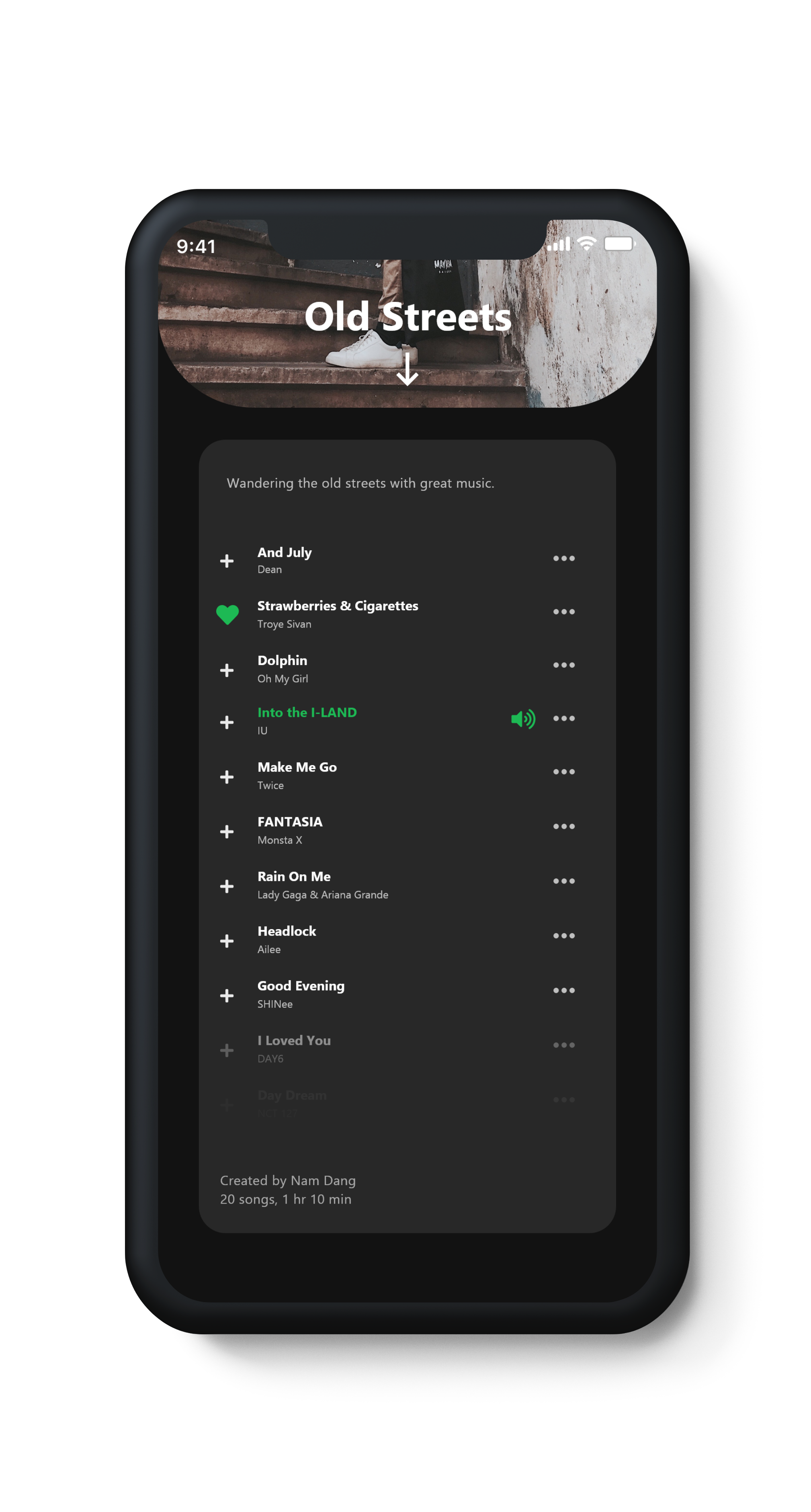
Album Cover
When click on the album cover, the whole playlist will appear. Users can check out the songs by scrolling the playlist.
Swipe down from the cover will help users go back to the Playlist homepage.
Swipe down from the cover will help users go back to the Playlist homepage.

New Playlist
Users create a new playlist from the homepage by simply click on the button.
Swipe right to go back to the "Main" playlist.
Swipe right to go back to the "Main" playlist.